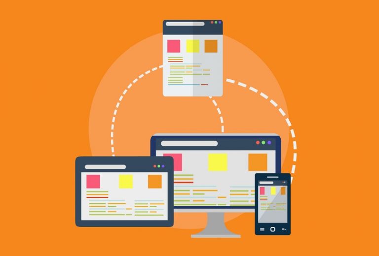
Responsive web design allows sites to adapt to the capabilities of mobile devices, optimizing the loading and appearance of all its elements. Having this capacity today would not only be perfect, but also essential for your page to gain relevance.
The reason is obvious, it is not a secret that a large part of the population has a smartphone. And, in them, it is much more comfortable and convenient to surf the internet.
However, if you still don’t know how to adapt or create a responsive design that is effective, here you will learn some tricks to achieve it.
1. Give you a mobile approach to entry
The normal thing when you want to create a website, is to design it based on a conventional device, that is, a computer or laptop. Although this is not a wrong move, if you want to have a responsive web design, it is important that you focus your development for smaller devices.
Otherwise, it is normal to find errors or problems when adapting the appearance of your page to the mobile version. This is why it is advisable to create a beautiful and functional portal for smartphones, and then develop it a little more so that it adapts to computers.
2. Convert your website
You may have gone to the trouble of creating your own website for a long time, but realized that an adaptive design was necessary to keep moving forward. In that case, there are ways to convert or adapt your page to a mobile version, here you can learn about two of the most common and effective procedures.
3. If you use a content management system (CMS)
Generally, when you use a content manager to create your website, it is almost certain that it has a plugin to adapt the responsive web design. Although, it is important that you consider that, for some CMS, it will be much more practical than for others.
In this sense, if you are one of the people who has a domain in WordPress, it will be possible for you to use two extensions to adapt a responsive page. These are: WPtouch and, the most used and known, JetPack.
In the case that you don’t use WP, but if you use another manager like Drupal, you can use other plugins like ThemeKey or MobileTheme. On the other hand, if you are one of those who use Joomla, you can install the JoomlaShine and Responsivizer tools.
These CMSs mentioned above are the ones with the best adaptive response to the mobile version of web pages.
4. Use an online page converter
If you did not base your page on a content manager and, instead, you used a custom development, it is not limiting to apply responsive design to your website. This can be done through an online application capable of applying the change.
For example, you can use bMobilized, a tool with a cost of around EUR 15 per month, and which allows you to adapt all the elements of your website. In addition, it has a special support for developers.
You can also use the services of Duda Mobile. This application works as a creator of web pages mainly specified for mobile devices, like a converter, and that you do not have to pay to use. Although, if you want to use the more advanced features, it is necessary to pay for the Premium status.
5. Use a responsive page appearance
Creating a website from a mobile approach or transforming it are not the only alternatives you have to apply a responsive web design. There are other ways to achieve this, and in this case, you can use themes that adapt to different devices.
These are known as adaptive or responsive themes, and many content managers have them, especially WordPress.
That said, if you already have a domain on this CMS, you can do a search in the theme catalog to find one that has these responsive features. The best thing is, most of them do not have an additional value, and beyond what you can think, they work really well.
Although, a recommendation for this particular matter is to use the Avada theme, which has an amazing loading speed (up to 1 second). You can check it with the Pingdom tool, with which you can also test different facades.
6. Do not include elements that use Flash
There is a reason that many sites have abandoned the idea of using Flash on their websites. This is mainly due to the fact that these elements require too many resources to be processed, increasing the loading time.
Most importantly, iOS and Android devices are unable to support the nature of these items. Therefore, if you want to get a responsive web design now or in the future, you should discard the idea of including Flash.
7. Optimize loading speed
Many times, that your page has a responsive web design, it may depend solely on the speed it takes for the site to load its elements. There are many factors that influence this statistic, be it aesthetics, image size, server, or the type of storage you use.
In this sense, using Cloud Hosting as the main server can greatly help to improve the load factor. As for storage, VPS will give you a more optimal performance.
On the other hand, the images and their size can favor you to have a responsive page. To do this, it will be enough to reduce its weight with any compression web, such as Tinypng.